Tuesday, June 26, 2012

July 2012 CARDS Magazine Project

So part of the reason the blog's been a little neglected lately is because I've been working on publishing projects and I can't share those until after the issues come out.

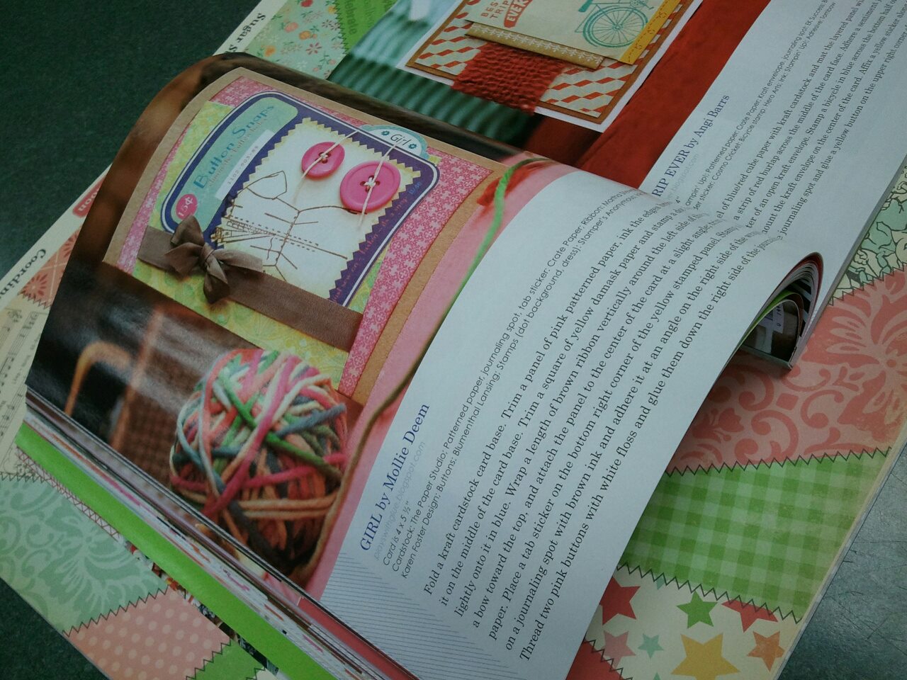
This month I have a card in  Cards magazine.


Sounds pretty swanky, right?
Well, I'm going to let you in on a dirty little secret. Just don't tell, okay? ;)

(page 52)

 Sometimes I really, really want to be creative. Like knock your socks off, brilliantly creative. But my real job doesn't always leave a lot of brain power to work with by the end of the week. So when I'm in an "I just want to create" mood, I like to pick up scraps and extras and just play. I like to try new techniques, experiment with ideas I haven't vetted yet and see what I come up with. I like to use my scraps because then I don't feel bad about "wasting" supplies if the experimentation goes awry... and trust me, that happens!

The night that I designed this card I was totally, 100% brain dead. It had been a tough week at work and some friends and I decided to get together on a Friday night to relax and scrapbook. So I grabbed a few leftover supplies from my design team kit from The Scrapbooking Studio, a stamp set I'd been wanting to play with, and some ink. My friends came over and I'm pretty sure there was waaaay more gabbing than gluing that night. In several hours I only made two or three cards because we were too busy talking to really get anything done. A couple of weeks later, there was a submission call from Cards that this piece fit into, so I submitted it on a whim and voila! it was selected... my simple little card that I just "tossed" together one night.

So my point to sharing this with you? That you don't have to design specifically for a call. Play with your supplies, see what you come up with and if there happens to be a submission call that it fits, submit it!

Thursday, June 21, 2012

Crate Paper "Farmhouse" layout: sweetie pie

Hello! Sorry, I've been on a super long blog hiatus. I've been busy with a little bit of publishing work and planning a impromtu 50-person scrapbooking retreat for this summer while trying to exorcise (purge) my scrapbooking stash. Oh yeah, and trying to get acclimated to my new full time job. Whew... just a couple of things happen around here!

So I thought I'd catch up on some posting and found a few things from last fall that I apparently forgot to post. Oopsie!

Version 1 of the layout. The pink background was just NOT working for me. Not loving it. No way.

Version 2.0
Time to tear it apart and re-work it! Yes, that's right. If I don't like a layout, I really do just pull it all up and start again!
Much better, right? :)

Supplies: Patterned papers, stickers, chipboards - Crate Paper; Flower - Prima; Tag and Twine, Doily Edge Punch - Martha Stewart; Stick pins - Maya Road; Green Ribbon - May Arts; Doily - craft supply; Marker - Copic, American Crafts; Chalk ink - Colorbox.

Friday, May 18, 2012

Looking for the non-obvious product uses

I am always on the look out for supplies that can serve many purposes. When I first started scrapping I was always looking for themed embellishments to go on my layouts, but it seemed like enviably I either couldn't find something that I liked or when I'd finally get around to do the layout that I'd forget to use it.

And then one day I had an ephinay ...just limit my supplies to non-themed products that could be used equally well on a wide variety of layouts. That quite possibly was one of the most transformational moments in my scrapbooking approach. (Well, that and the day that I changed my organizational system to be based on ROYGBIV color order.)

So now I am always on the lookout for things that I can use in other ways. One of my favorite ways to repurpose products is to buy Halloween themed products to use on my high school layouts. My high school colors were orange, black, and white so at the end of the halloween season I look for products with universal designs in these colors. Usually I can find some good stuff on sale!

Halloween Divine Twine by Whisker Graphics


Twine is one of those things that work well for this. You can use it like ribbon, tie it in loops to make a flower, or make little poms out of it. So all of you UTHS, Valley, and Ames High moms... How cute would this be tied around jars and hanging decorations for graduation parties and then added to layouts in your seniors scrapbooks? You can win some over on the Whisker Graphics blog!

Monday, April 23, 2012

Retreat projects and some additional crop spots

Day Cropping Spots Added

I just added a few day crop seats to the registration page.

If you can't crop for the whole weekend and just want to join us for Friday or Saturday, check it out.

Friday only (15hrs) - $25
Saturday only (18hrs) - $30

(Please register by midnight on Wednesday so I can get your goodie bags ready and get you added to the seating chart.)
 
Seriously... who can pass up a Baker's Twine Buffet that includes EVERY COLOR of Divine Twine?
 
 
Plus, I've been busy making up some super cute surprises for the croppers!
 
You know you want one! :)
 

Tuesday, March 27, 2012

Creative Chemistry 101 - Day 7


Embossing powders. Love the look, hate the mess. Truly, I'm only doing this for Tim! (Because you all know how much I hate a mess!)
Nostalgic Batik
First up in today's creative adventure is using embossing powders in a batik fashion. I have to admit that I didn't take it all the way to the batik level (embossing was more than enough hassle for today... we don't need to add an iron to this crazyness!)

Version 1.0 was clearly an epic fail as well. Couple of notes here: Even when using a super fine detail embossing powder, stamps that are really intricate, too small, or semi-distressed won't hold enough powder to do this techinque justice. So scroll on by to see version 2.0... 

All around this one was a much more successfull effort. 
(I still didn't haul out the iron so this i more "embossed resist" than "embossed batik.")
 Flowers: Distress ink in Spiced Marmalade; Super Fine Detail embossing powder from Ranger.
Background Distress Inks: tumbled glass, peeled pain, broken china, crushed olive, dusty concord. (Sprayed with water and blotted with cloth.)
Edges Distress Inks: Walnut stain (applied inkpad directly to edges)
Weeds are stamped in Vintage Photo


Rusted Enamel Technique
I am frequently inspired by colors, designs, and patinas I spot at junk stores, so I was particularly excited to learn this technique! In Tim's version he used an assortment of browns, but in my world rusted patinas tend to be more aquas and oranges so I made a few substitutions... I'm sure he won't mind. :)  I also didn't have any regular embossing powder (as Tim recommends) so I used super fine again here as well. I had a little trouble getting the blending tool to work in a sufficient amount of ink so I also just went direct to paper (with the inkpad) for this one too.
Background Distress Inks: Tumbled Glass, Evergreen bow, Rusty hinge


Distress Powder Resist
Not one of my favorites, so just posting the picture and moving on. (Although I can see some potential for combining the rusted enamel and this technique to create some cool rusted metal effects. ...Will have to try that later.)
Distress Powder: Tattered Rose
Distress Inks: peeled paint, shabby shutters, worn lipstick, walnut stain

Monday, March 26, 2012

Creative Chemistry 101 - Day 6


Drum roll please...

Today's the day I've been waiting for...

That's right, it's Distress Markers day!
*crowd cheers wildly*
Is this not just one of the yummiest photos ever? :)


Watercolor with Markers Technique
Okay, so this technique might not be for me. I tried it several different ways and had trouble replicating what Tim was doing. There might be a reason that my past attempts at watercoloring worked better with my fingers than a brush. Plus I really don't like the whole "watercolor" look, but some of the samples in the class gallery were sooooo pretty that I thought I'd at least give it a go. And that I did, with menial success. I'll spare you the gory details and just post samples of the epic fails so you all know I'm human... LOL! (Keep calm and scroll on. I promise to redeem myself by the end of this post.)

 Epic fail 1.0

Epic fail 2.0

 Epic fail 3.0

And finally, epic fail 4.0


Stamping with Markers Technique
 Ah, finally... this is where it gets good again. Whew! I was worried for a minute there!
I love, LOVE, L-O-V-E this technique. I may replicate it everywhere and oh, my... can't you just imagine this background swapped out for a snowy wintery scene?

Now keep in mind that this is your every day "spritz n' flick" technique, but when you're working with the new Specialty Stamping Paper from Ranger you get a whole new effect from this same, super simple technique.

So you can see I once again broke out my trusty dress form stamp and "standard" palette to try out stamping with markers. Good news! It didn't disappoint. I love how subtle the transitions are from one color to the next.
Stamped image is first generation on specialty stamping paper.
Distress Markers: barn door, worn lipstick, spun sugar, spiced marmalade, mustard seed, crushed olive, shabby shutters, broken china, tumbled glass, black soot (left edge).
Distress inks (background): pumice stone, dusty concord.

 Must make note to self, distress markers are the markers that just keep on giving! Check out this second generation image! Love the softness this creates.

Oh, but wait! We're not done yet! This is a THIRD generation image from the same inking, just misted the stamp with water to stamp with a watercolor effect. Look how the colors just come back to live and pop vibrantly against the white background. 

I soooo have to remember to get more use out of each stamp inking and not just automatically reach for the cleaner after the first generation image is done.

Friday, March 23, 2012

Creative Chemistry 101 - Day 5


Bear with me kids, we're halfway through the class which means the blog will only be hijacked by Creative Chemistry for another 5 (or so) days...

Stained Kraft Resist Technique
Now this is a technique for me. I mean, after all...I'm a total kraft paper junky! If you can combine kraft paper with some inky goodness then SIGN ME UP! :)

For this first sample I tried to be quite similar to what Tim's example looked like. It helps me kind of "figure out" the technique and makes it easier to tell if the technique didn't work because I didn't have the technique going quite right or if I just picked horrible colors...because well, one thing I'm learning is that these inks can do some crazy good (and not so good) things depending on how you're applying them.
Distress stain colors: broken china.
Distress ink colors: weathered wood, crushed olive, dusty concord, frayed burlap
Extra technique applied: "Spritz n' flick"

 Next I tried the technique using the "standard" color palette I've been working with. As I've been making samples I've been trying to work with the same colors so I can learn how the colors shift and change across various mediums and different applications. With this technique I learned that the colors shift to become much darker and more muted. This is, of course, to be expected since they're translucent dyes and kraft is a dark substrate compared to white paper.
Distress inks: fired brick, barn door, spiced marmalade, rusty hinge, broken china, dusty concord, peeled pain with frayed burlap on the edges. 
Stamped image is Distress Ink "Black Soot"
Extra technique applied: "Spritz n' flick"


Stamping with Stains
Okay, so this technique rocks my world just a wee little bit. I'm not sure why, but I completely fell in love with the semi-transparent, milky like effect of stamping with Picket Fence Distress Stain. On this one I stamped with a lighter color (Archival Ink in Maganese Blue) because I wanted to see what affect it would have. I learned that even though the Maganese Blue was stamped OVER the Picket Fence, the translucent properties of the Archival Ink (dye-based) allowed the Picket Fence to look as though it was on top of the stamped image. Pretty cool, huh? Creates a little bit of a trump l'oeil effect. If you didn't want this look, you can always stamp over the Picket Fence with Archival Black instead.
Distress Stain: Picket Fence
Distress Ink: Fired brick, barn door, wild honey, tumbled glass, broken china, shabby shutters, peeled paint, dusty concord.
Dress form stamped image: Ranger Archival in Maganese Blue


Marbled Stains
This techinque is way cool. Not only can you create a mottled, marble effect, you can also create a look like marbled veins just by changing the way you apply the stains to the tag.

For the first one I stayed pretty close to Tim's example by using similar colors and "swiping" technique. The only thing I changed was to stamp my "weeds" in Sepia and the "splatters" in Olive so that I created the look of more layers to give depth to the piece.

Distress Stains: peeled paint, broken china, antique linen, wild honey, picket fence.
Distress Ink (edges): Weathered Wood
Stamps - Ranger Archival: Bird - jet black; Weeds - sepia; Spatters - olive
Stamps: Urban Tapestry from Stampers Anonymous

All excited by how well that one came out I decided to try it again, but this time I changed up the swiping technique and pulled the card through the stains in a linear fashion to create streaks of "marble veins." Seriously, how cool is that background?

Distress stains: Fired brick, wild honey, antique linen, picket fence.
Distress ink (edges): vintage photo
Stamps - Ranger Archival: Numbers - sepia; Dress form - jet black