Tuesday, March 27, 2012

Creative Chemistry 101 - Day 7


Embossing powders. Love the look, hate the mess. Truly, I'm only doing this for Tim! (Because you all know how much I hate a mess!)
Nostalgic Batik
First up in today's creative adventure is using embossing powders in a batik fashion. I have to admit that I didn't take it all the way to the batik level (embossing was more than enough hassle for today... we don't need to add an iron to this crazyness!)

Version 1.0 was clearly an epic fail as well. Couple of notes here: Even when using a super fine detail embossing powder, stamps that are really intricate, too small, or semi-distressed won't hold enough powder to do this techinque justice. So scroll on by to see version 2.0... 

All around this one was a much more successfull effort. 
(I still didn't haul out the iron so this i more "embossed resist" than "embossed batik.")
 Flowers: Distress ink in Spiced Marmalade; Super Fine Detail embossing powder from Ranger.
Background Distress Inks: tumbled glass, peeled pain, broken china, crushed olive, dusty concord. (Sprayed with water and blotted with cloth.)
Edges Distress Inks: Walnut stain (applied inkpad directly to edges)
Weeds are stamped in Vintage Photo


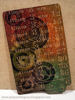
Rusted Enamel Technique
I am frequently inspired by colors, designs, and patinas I spot at junk stores, so I was particularly excited to learn this technique! In Tim's version he used an assortment of browns, but in my world rusted patinas tend to be more aquas and oranges so I made a few substitutions... I'm sure he won't mind. :)  I also didn't have any regular embossing powder (as Tim recommends) so I used super fine again here as well. I had a little trouble getting the blending tool to work in a sufficient amount of ink so I also just went direct to paper (with the inkpad) for this one too.
Background Distress Inks: Tumbled Glass, Evergreen bow, Rusty hinge


Distress Powder Resist
Not one of my favorites, so just posting the picture and moving on. (Although I can see some potential for combining the rusted enamel and this technique to create some cool rusted metal effects. ...Will have to try that later.)
Distress Powder: Tattered Rose
Distress Inks: peeled paint, shabby shutters, worn lipstick, walnut stain

Monday, March 26, 2012

Creative Chemistry 101 - Day 6


Drum roll please...

Today's the day I've been waiting for...

That's right, it's Distress Markers day!
*crowd cheers wildly*
Is this not just one of the yummiest photos ever? :)


Watercolor with Markers Technique
Okay, so this technique might not be for me. I tried it several different ways and had trouble replicating what Tim was doing. There might be a reason that my past attempts at watercoloring worked better with my fingers than a brush. Plus I really don't like the whole "watercolor" look, but some of the samples in the class gallery were sooooo pretty that I thought I'd at least give it a go. And that I did, with menial success. I'll spare you the gory details and just post samples of the epic fails so you all know I'm human... LOL! (Keep calm and scroll on. I promise to redeem myself by the end of this post.)

 Epic fail 1.0

Epic fail 2.0

 Epic fail 3.0

And finally, epic fail 4.0


Stamping with Markers Technique
 Ah, finally... this is where it gets good again. Whew! I was worried for a minute there!
I love, LOVE, L-O-V-E this technique. I may replicate it everywhere and oh, my... can't you just imagine this background swapped out for a snowy wintery scene?

Now keep in mind that this is your every day "spritz n' flick" technique, but when you're working with the new Specialty Stamping Paper from Ranger you get a whole new effect from this same, super simple technique.

So you can see I once again broke out my trusty dress form stamp and "standard" palette to try out stamping with markers. Good news! It didn't disappoint. I love how subtle the transitions are from one color to the next.
Stamped image is first generation on specialty stamping paper.
Distress Markers: barn door, worn lipstick, spun sugar, spiced marmalade, mustard seed, crushed olive, shabby shutters, broken china, tumbled glass, black soot (left edge).
Distress inks (background): pumice stone, dusty concord.

 Must make note to self, distress markers are the markers that just keep on giving! Check out this second generation image! Love the softness this creates.

Oh, but wait! We're not done yet! This is a THIRD generation image from the same inking, just misted the stamp with water to stamp with a watercolor effect. Look how the colors just come back to live and pop vibrantly against the white background. 

I soooo have to remember to get more use out of each stamp inking and not just automatically reach for the cleaner after the first generation image is done.

Friday, March 23, 2012

Creative Chemistry 101 - Day 5


Bear with me kids, we're halfway through the class which means the blog will only be hijacked by Creative Chemistry for another 5 (or so) days...

Stained Kraft Resist Technique
Now this is a technique for me. I mean, after all...I'm a total kraft paper junky! If you can combine kraft paper with some inky goodness then SIGN ME UP! :)

For this first sample I tried to be quite similar to what Tim's example looked like. It helps me kind of "figure out" the technique and makes it easier to tell if the technique didn't work because I didn't have the technique going quite right or if I just picked horrible colors...because well, one thing I'm learning is that these inks can do some crazy good (and not so good) things depending on how you're applying them.
Distress stain colors: broken china.
Distress ink colors: weathered wood, crushed olive, dusty concord, frayed burlap
Extra technique applied: "Spritz n' flick"

 Next I tried the technique using the "standard" color palette I've been working with. As I've been making samples I've been trying to work with the same colors so I can learn how the colors shift and change across various mediums and different applications. With this technique I learned that the colors shift to become much darker and more muted. This is, of course, to be expected since they're translucent dyes and kraft is a dark substrate compared to white paper.
Distress inks: fired brick, barn door, spiced marmalade, rusty hinge, broken china, dusty concord, peeled pain with frayed burlap on the edges. 
Stamped image is Distress Ink "Black Soot"
Extra technique applied: "Spritz n' flick"


Stamping with Stains
Okay, so this technique rocks my world just a wee little bit. I'm not sure why, but I completely fell in love with the semi-transparent, milky like effect of stamping with Picket Fence Distress Stain. On this one I stamped with a lighter color (Archival Ink in Maganese Blue) because I wanted to see what affect it would have. I learned that even though the Maganese Blue was stamped OVER the Picket Fence, the translucent properties of the Archival Ink (dye-based) allowed the Picket Fence to look as though it was on top of the stamped image. Pretty cool, huh? Creates a little bit of a trump l'oeil effect. If you didn't want this look, you can always stamp over the Picket Fence with Archival Black instead.
Distress Stain: Picket Fence
Distress Ink: Fired brick, barn door, wild honey, tumbled glass, broken china, shabby shutters, peeled paint, dusty concord.
Dress form stamped image: Ranger Archival in Maganese Blue


Marbled Stains
This techinque is way cool. Not only can you create a mottled, marble effect, you can also create a look like marbled veins just by changing the way you apply the stains to the tag.

For the first one I stayed pretty close to Tim's example by using similar colors and "swiping" technique. The only thing I changed was to stamp my "weeds" in Sepia and the "splatters" in Olive so that I created the look of more layers to give depth to the piece.

Distress Stains: peeled paint, broken china, antique linen, wild honey, picket fence.
Distress Ink (edges): Weathered Wood
Stamps - Ranger Archival: Bird - jet black; Weeds - sepia; Spatters - olive
Stamps: Urban Tapestry from Stampers Anonymous

All excited by how well that one came out I decided to try it again, but this time I changed up the swiping technique and pulled the card through the stains in a linear fashion to create streaks of "marble veins." Seriously, how cool is that background?

Distress stains: Fired brick, wild honey, antique linen, picket fence.
Distress ink (edges): vintage photo
Stamps - Ranger Archival: Numbers - sepia; Dress form - jet black

Thursday, March 22, 2012

Creative Chemistry 101 - Day 4


Watercoloring wth Re-inkers Technique
Today we're breaking out the watercolor brushes (that I seriously have had for like 7 years and used once). 

This technique was supposed to be about putting re-inkers in a paint palette, but since I only have a few re-inkers I had to improvise. So I took my distress inkpads and rubbed them on the palette edges. The colors weren't as intense as they probably would've been if I'd actually had wells of re-inker, but it worked well enough to try the technique. 

And here's what came out of those little ink droplets:

Distress Ink Colors: Barn Door, Fired Brick, Worn Lipstick, Mustard Seed, Wild Honey, Spiced Marmalade, Crushed Olive, Peeled Paint, Tumbled Glass, Broken China, and Pumice Stone for the background.


Layered Misting Technique
Playing mad scientist for this technique. Mixing up a brew of re-inkers and water in some mini-misters to make some custom sprays for this technique.
Re-inker Colors: Tumbled Glass, Wild Honey, Antique Linen. 
Color wash sprays: Butterscotch, Expresso


Custom Stamp Pad Technique
{Imagine a lovely stamped image here. No cut-n-dry Felt, no project. *sad face*}

Wednesday, March 21, 2012

Creative Chemistry 101 - Day 3


Alcohol Ink Agates Technique
Colors: Alcohol Inks - Sunset Orange, Sunshine Yellow, Citrus, Copper Mixative. Archival inks - Olive, Sepia, Coffee.

Today we're working with alcohol and archival inks. On the first version of this technique I tried using pretty much the entire ROYGBIV spectrum. And while it probably would've worked for a circus themed project, it just really wasn't floating my boat, so I abandoned it to work with 3 colors + a mixative. I have to admit, the "agate" look just isn't my thing, but I do like the mottled effect that you can get by using 2 or 3 colors at a time and occassionally adding in some mixatives to it as well. Personally, I think there are much better uses for alcohol inks like these Vintage Ornaments or the ink splattered technique using compressed air.

Archival Resist Technique
Colors: Archival inks - maganese blue, olive, crimson, jet black. Distress ink - vintage photo.

Okay, so I think this technique has the potential to make for some VERY cool things, but unfortunately my archival ink supply is a bit limited and I didn't have the bright colors needed to really do this justice. In the mean time, just image inks glowing with an almost florescent property against a dark background. See what I mean, cool.

Stamping with Reflections Technique
Colors: Embossed floral area - Distress Barn Door, Fired Brick, Mustard Seed, Spiced Marmalade, Wild Honey, Shabby Shutters, Peeled Paint. Backround - Antique Linen, Vintage Photo, with Walnut Stain on the edges. Archival inks - Sepia, Coffee, Jet Black, Maganese Blue.

Okay, so have you seen those cool background stamps that Tim released at CHA last summer? Did you notice that the type was backwards and wonder why? Well, here's your answer: so that you can stamp them on an embossing folder and do this cool technique with it! I'm mean, wasn't that obvious? (Yeah, I didn't get it either. Heck, I'm not even sure I noticed they were backwards until after I bought them!)

Alright kids, that's it for today. If you're thinking this is sooo cool. Sign up for the class! It's only $35 and you can still jump in without being too far behind.

Tuesday, March 20, 2012

Creative Chemistry 101 - Day 2


Alrighty, today's the day to start gettin' inky with it! I've got my rubber glove on (just one hand, I like to think of myself as the Michael Jackson of the crafting world, ha!) and I'm ready to rock some distress inks Tim Holtz style!

First up, the "Blended Distress/Spritz & Flick Technique"
Colors used: Shabby Shutters, Peeled Paint, Dusty Concord, Broken China, Wild Honey, Barn Door, Fired Brick.

This is a technique that I had leaned before but wasn't having satisfactory success with... until now! The minute I watched Tim demonstrate this technique I had one of those "Aha!" moments where you instantly realize where you've been going wrong the whole time. (And then you secretly wonder why you didn't figure that out sooner!) ...I wasn't opening my palm to let the water roll down my fingers. I was kind of just turning it to let the water roll out as though you were spilling water from a cup. Note to self: Rolling down fingers = good. Spilling like a cup = bad.


Next up, "Brushless Watercolor Techique"
Colors: Background - Pumice Stone; Dress Form - Mustard Seed, Spiced Marmalade,  Wild Honey, Barn Door, Fired Brick, Shabby Shutters, Peeled Paint, Broken China, Dusty Concord; Edged in Frayed Burlap.

I had also learned this technique in an earlier class. Feeling a little more comfortable with it, I thought I'd play around and experiment a bit to see what I could accomplish.

First I tried making soft backgrounds (left and right samples shown above). I applied ink to an Altered Background stamp and spritzed it with water, then stamped the image onto the watercolor paper. Here's were I diverged from the original technique: instead of drying the stamped image as is, I blotted away the excess water with a towel. This gives a nice, even-toned watercolor look. No areas where the distress ink concentrated a little more or less, just all nicely balanced.

Then I tried a couple of different approaches with the dress form image. In the first attempt (left) I added just various colors of distress ink to the stamp, spritzed it with water and stamped it.

While I like the brightness of the colors, I wanted the image to "pop" a little more. So then I re-applied the same colors, but this time I also inked the edges of the stamp with a little Frayed Burlap. Spritzed the stamp with water and stamped it again. This created a really cool shadow along the left edge of the bodice and gave it the depth I was looking for.

Lastly, I stamped a second generation image using the "with frayed burlap" version onto a plain white background since this was the actual technique called for in the class.

Last but not least, "Wrinkle-free distress technique"
Colors:

This is not my first dance with this technique either. I "learned" it at a Lynn Warner make-n-take and have also seen it on one of Tim's videos along the way, but for some reason it kept coming out like I had two left feet. Love the look, but just wasn't pulling it together. Aha! Lightbulb moment! I was doing two things wrong:
1.) I was getting the ink on the craft sheet too wet so I was just picking up giant puddles. 
2.) I wasn't drying the inks in between picking up the layers of ink. *duh*

So there you have it. First day of techniques completed... and 8 more to go! I can't wait!

Monday, March 19, 2012

Creative Chemistry 101 - Day 1


So today is the opening day of Tim Holtz's first-ever online class, Creative Chemistry 101. I was lucky enough to take a class from him in-person last summer. Being the technique junky that I am who loves to know all about why things work the way they do, I jumped at this chance to learn the hows and whys behind all of the different products.

Today's lessons are all about learning the properties of different products, so nothing to see! Instead I thought I'd leave you with a fun picture of some distress inks beaded up in water on a non-stick craft mat. Oh look at all of the creative potential just sitting there!


Thursday, March 15, 2012

Gearing up for Creative Chemistry 101

If you've ever wondered how to use all of Tim's inky goodies, this is the time to learn! Tim Holtz is teaching his first-ever online class starting next week. If it's anything like his live classes, I'm sure it's going to be phenomenal!
I'm all signed up and just need to get my supplies gathered so I'm ready to hit the ground running. In honor of a creative journey that's about to embark, I thought I'd share a little inky goodness with you made (mostly) from Tim Holtz and Ranger supplies.

 
Check out how the rock candy distress paint makes the pot look like a piece of crazed pottery. How cool is that!?

Plus, you can get a cool mosaic effect by applying fragment tiles over the top of the canvas. Apply a bit of glossy accents to each tile and then wiggle it around to make sure that the glue is evenly coated on the tile.

Today is all we need to nuture
Supplies: Adirondack ink, Rock candy distress paint, distress inks - Tim Holtz/Ranger; Clear plastic fragments - Tim Holtz/Advantus; Paints - Making Memories, Ranger; Black & brown inks - Versafine; Glue - Glossy Accents, Scotch; Leaf die - QuicKutz; Label Die - Spellbiners; Damask Stamp - unknown; Bingo, quote, foliage stamps - Unity; Button - Making Memories; Chipboard - Fancy pants; Yarn embellisment - Jillibean; Canvas - Michaels; Floral wire - JoAnn's Crafts; Paint brush - Home Depot
 If you're interested in signing up for the Creative Chemistry 101 class check it out here.

Thursday, March 8, 2012

Authentique Mini for The Scrapbooking Studio

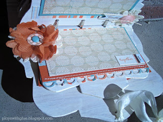
I know it isn't Monday, but this is my last "Design Team Thursdays" post for awhile so I'm sharing a mini book made for The Scrapbooking Studio Design Team. There are lot of pages, so this post will be just pictures. Scroll through and enjoy. Head on down to The Scrapbooking Studio to see it in person -it's soo much cooler in person!


I used a fun multi-layer painting technique to create a strie style effect to the cover and pages. It's sooo much easier to paint these odd shaped pages than than to cover them with papers, plus it holds up much better to handling too.

I am in love with stitching things right now and the Janome Sew Easy works beautifully on paper. It stitches a little slower than bigger machines which makes it easier to stitch straight and it feeds better. Plus, it's portable size doesn't take up too much space on your crafting table.

I layered one of the matching die cuts on a button to give it a little extra dimension.

I cut up a Prima floral spray to make little mini bouquets for the pages.


Stitching the "family" tab on allows you to slip the photo underneath later, plus you don't have to adhere it to the top of the photo either. 

Well, that's it. My last project for The Scrapbooking Studio Design Team. I've really enjoyed designing for them and I hope you've found some inspiration along the way!